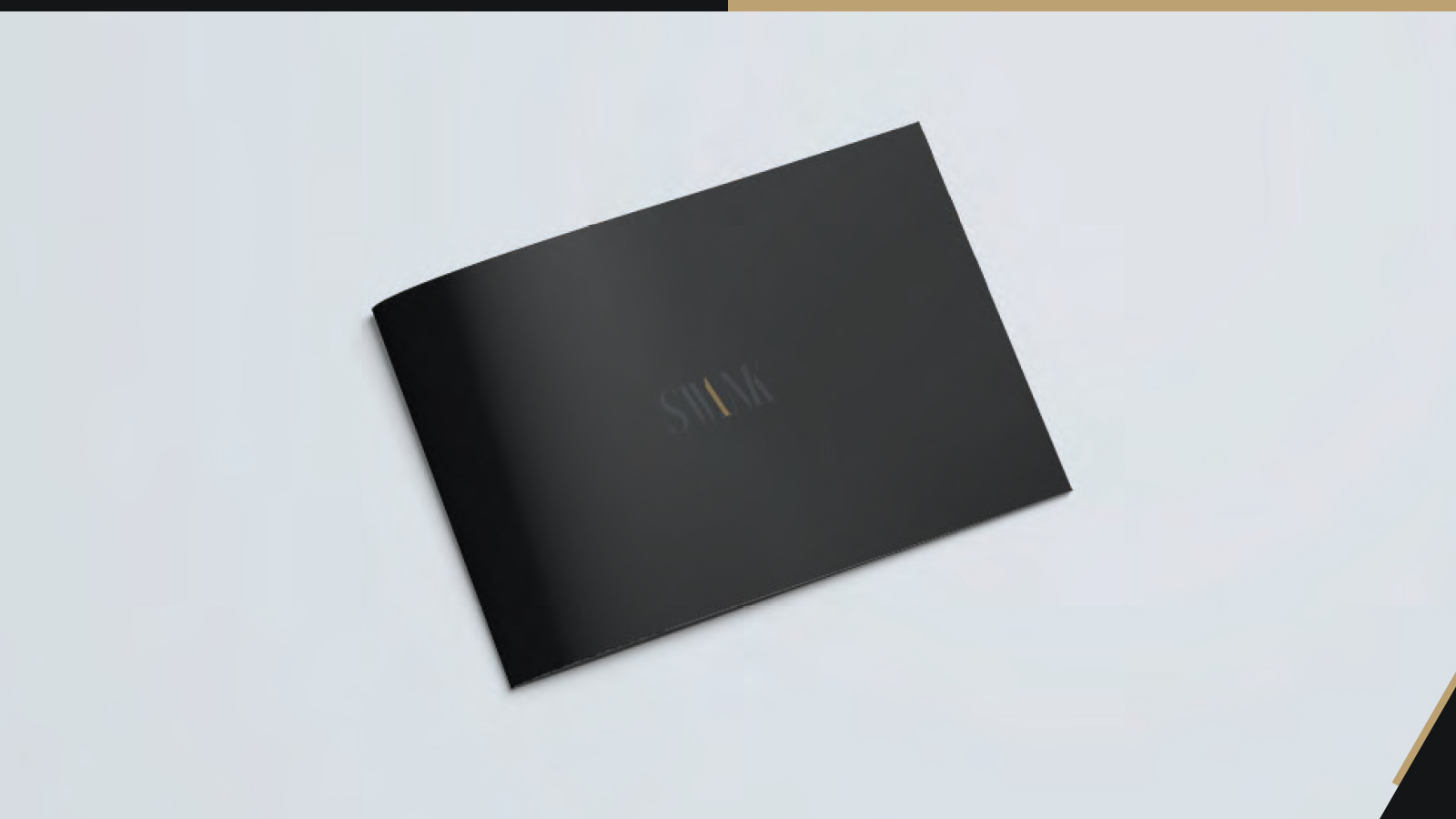
Swank is an interior design firm that was in need of a logo to boost their brand. They wanted elegance and confidence to come through in the final design, so I focused on a darker color palette, with a hint of gold, to go along with an altered serif typeface. The removal of typographic elements points to a statement the owner said during our talks, “what is known doesn’t need to be stated.
Details
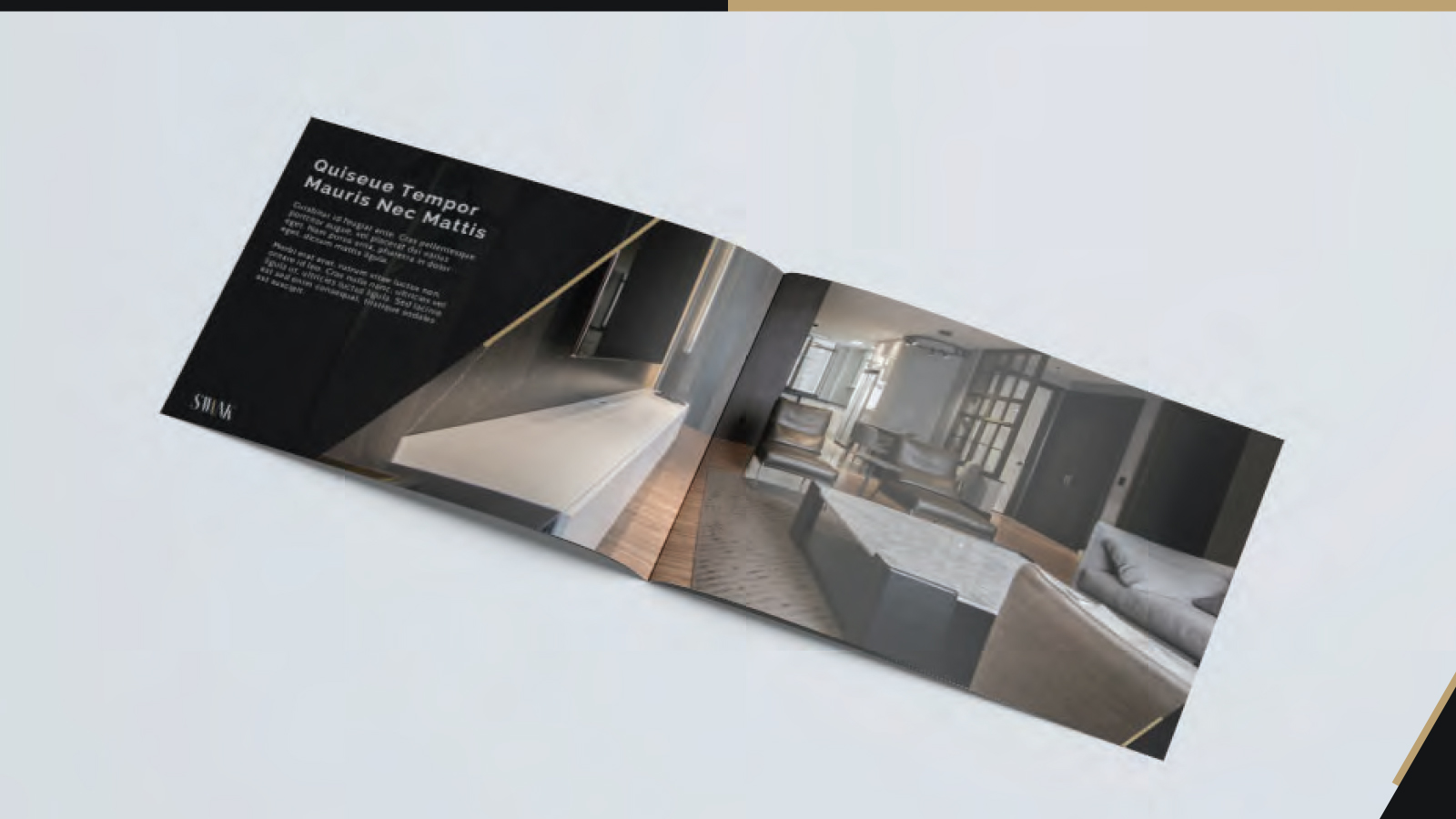
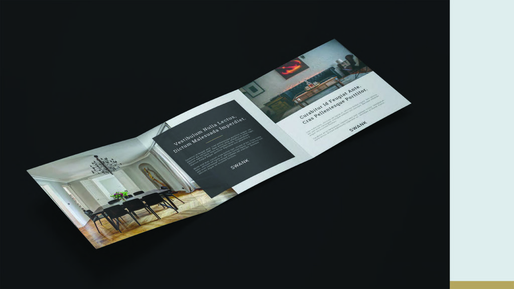
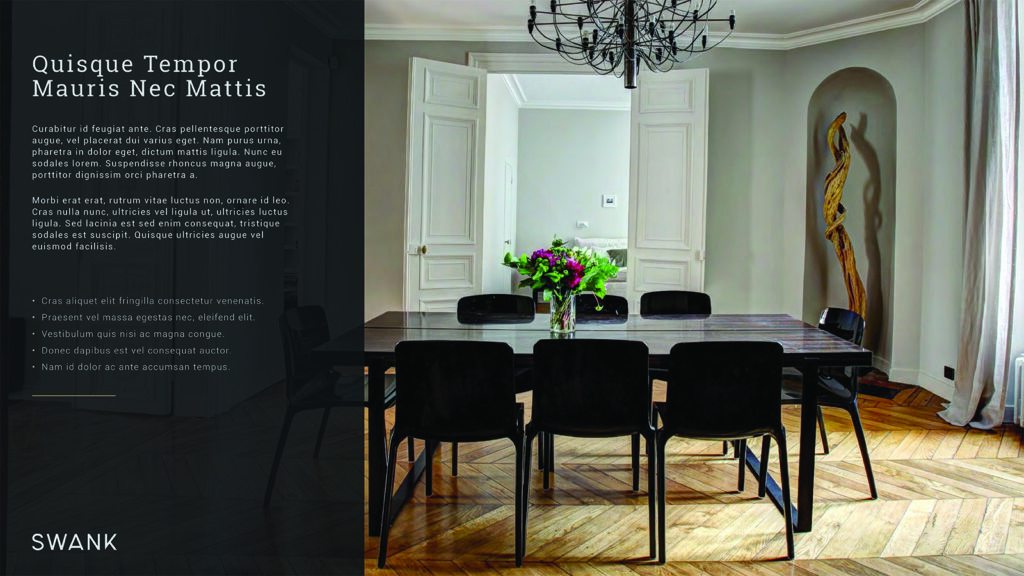
Services Logo Design, Print Design, Presentation
Role Lead Designer
Date October 2020
Alternate Logo Option
This alternate option was also presented to the client, but ultimately wasn’t chosen. This option had a more modern feeling typeface to go along with the same color palette.